
Creating a Navbar with Angular 17 and Tailwind CSS
Angular is a popular front-end framework, currently in its 17th iteration! Developed by Google and loved by many, it is currently one of the most relevant technologies one can be learning today. Tailwind CSS, another technology that has been around for many years now, is gaining popularity for its simplicity, utility-first approach, and ease of use in designing modern user interfaces. Today we’ll be combining these two technologies to create a sleek navigation bar, offering a hands-on introduction to leveraging the strengths of both Angular and Tailwind CSS.
Create a new Angular Application
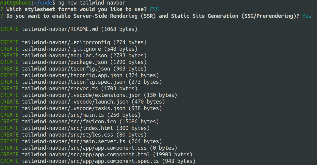
First, we’re going to create a new Angular application (this tutorial uses version 17.1.3 of Angular). We are going to name it tailwind-navbar. For this, we use the ng new tailwind-navbar command to get started with the application. This command will create our starter application to get started with Angular.
Open the folder in your preferred IDE
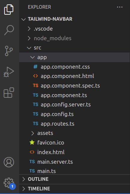
You can open the folder in your preferred IDE. I personally use Visual Studio Code, and I’d recommend the same to any beginner just so that one would not get worked up over what to use and just get started! Anyways, the image below shows the folder structure. For the purposes of this tutorial, we will only be working with a couple of files. If you want to learn more about the file structure, you could always refer to our Learning Angular article for more information.
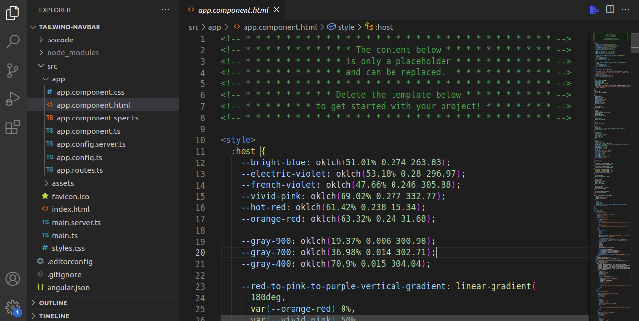
The app.component.html file is the view page which the end-user will be seeing; we can see that the file contains a lot of boilerplate code.
The code we see is just default code Angular provides that links to some learning resources and official documentation as well. We’ll be modifying this very page to create the navbar with Tailwind CSS. So, for that, we’ll be moving to the next step where we’ll be incorporating Tailwind into Angular!
Install and initiate Tailwind CSS
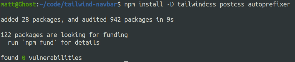
We’ll be using the following command to install tailwind to our application:
npm install -D tailwindcss postcss autoprefixer
Which will look like this:
After this we’ll be initializing tailwind into our program, in the same terminal from earlier:
npx tailwindcss init
The command will generate a tailwind.config.js file where we’ll configure and customize Tailwind CSS according to the specific requirements of the project. Next, we’ll go into the file itself and make some changes to it.
We’ll be adding "./src/**/*.{html,ts}" in the content property of the config file. The content property in the file is a glob pattern that matches all files with .html or .ts extensions within the src directory and its subdirectories.
We add the tailwind css to the global angular style (styles.css):
@import "tailwindcss/base";
@import "tailwindcss/components";
@import "tailwindcss/utilities";
Creating the navbar
Next, we’ll be adding the following code to the app.component.html to create the basic outline of our navbar!
<nav>
  <div>
        <a href="#">Logo</a>
    <ul>
      <li><a href="#">Home</a></li>
      <li><a href="#">About</a></li>
      <li><a href="#">Services</a></li>
      <li><a href="#">Contact</a></li>
    </ul>
  </div>
</nav>

<div>
  <h1>Welcome to Javascript Today!</h1>
  <p>This is a simple demonstration of a Tailwind CSS navbar.</p>
</div>
The code here shows us a simple navbar using basic HTML tools. The <nav> tag defines the navigation bar, and the <div> tag defines the body of the webpage. In the navigation bar, we have different ordered lists inside an unordered list, which will be our menus. The code above will give us the following output:
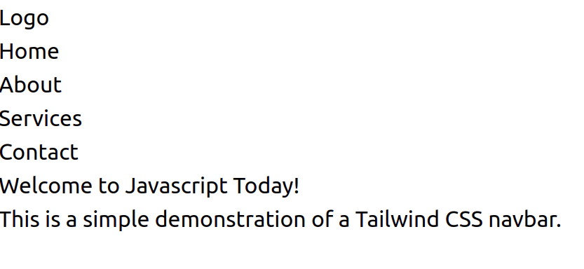
Now, that doesn’t look very appealing, does it? To make it more attractive, we’ll be taking Tailwind’s help. We’ll be adding multiple classes to the different HTML tags. Adding Tailwind CSS classes to HTML allows for rapid and efficient styling of elements through a utility-first approach, facilitating quick development.
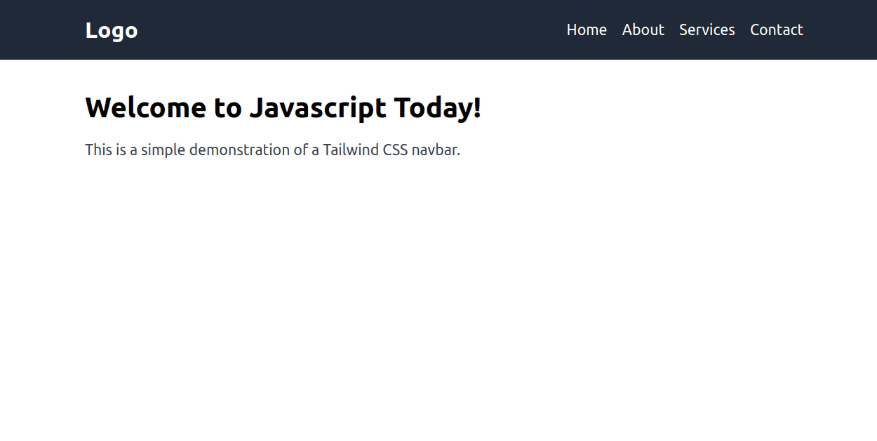
<nav class="bg-gray-800 py-4">
  <div class="container mx-auto flex justify-between items-center">
    <a href="#" class="text-white text-2xl font-semibold">Logo</a>
    <ul class="flex space-x-4">
      <li><a href="#" class="text-white hover:text-gray-300">Home</a></li>
      <li><a href="#" class="text-white hover:text-gray-300">About</a></li>
      <li><a href="#" class="text-white hover:text-gray-300">Services</a></li>
      <li><a href="#" class="text-white hover:text-gray-300">Contact</a></li>
    </ul>
  </div>
</nav>

<div class="container mx-auto mt-8">
  <h1 class="text-3xl font-semibold">Welcome to Javascript Today!</h1>
  <p class="mt-4 text-gray-700">
    This is a simple demonstration of a Tailwind CSS navbar.
  </p>
</div>
Now that we’ve made our updates, let’s take a peek at the refreshed code. Let’s dive in and unravel all the intriguing changes we’ve implemented with a closer look at each class:
bg-gray-800: This class sets the background color of the element to a dark gray color (#2d3748).py-4: This class sets padding on the y-axis (top and bottom) of the element to a size of 4, which is equivalent to 1rem (16px).container: This class centers the content horizontally and applies responsive padding to the sides.mx-auto: This class horizontally centers the element within its parent container.flex: This class applies CSS flexbox properties to the element, making its children flex items.justify-between: This class distributes the flex items along the main axis (horizontal axis) with equal space between them, pushing the first item to the start and the last item to the end.items-center: This class aligns the flex items along the cross axis (vertical axis) to the center.text-white: This class sets the text color to white.text-2xl: This class sets the font size to extra large, which is equivalent to 1.5rem (24px).font-semibold: This class sets the font weight to semibold.flex space-x-4: This class sets the display property to flex for the list items and adds horizontal spacing between them with a size of 4, which is equivalent to 1rem (16px).hover:text-gray-300: This class changes the text color to gray (#d1d5db) when the link is hovered over.mt-8: This class sets margin on the top of the element to a size of 8, which is equivalent to 2rem (32px).text-3xl: This class sets the font size to triple extra large, which is equivalent to 1.875rem (30px).mt-4: This class sets margin on the top of the element to a size of 4, which is equivalent to 1rem (16px).text-gray-700: This class sets the text color to a dark gray (#4b5563).
After executing all these commands, behold! We now have a sleek and polished webpage adorned with a perfectly structured navigation bar!
Full Code on GitHub
Conclusion
In wrapping up, the collaboration between Angular 17 and Tailwind CSS brings forth a compelling blend for crafting navigation bars that are both responsive and visually captivating. By harnessing Angular’s component-based architecture alongside Tailwind CSS’s utility-first methodology, developers gain a potent toolkit for building navigation interfaces that are not only dynamic but also highly customizable.
Like this article? Let us know in the comments below. Stay tuned for the next section, where we will add routing!
This article was written by Sarthak Pokharel, an experienced web developer with more than 4+ years of professional work experience.
Related Posts

Unveiling the Fascination of the Collatz Conjecture: Exploring Sequence Creation with JavaScript
The Collatz Conjecture, also known as the 3x+1 problem, is a fascinating mathematical puzzle that has intrigued mathematicians for decades. It has sparked publications with titles such as The Simplest Math Problem Could Be Unsolvable, or The Simple Math Problem We Still Can’t Solve because it is, indeed, rather simple-looking.
Read more
The Art of Data Visualization: Exploring D3.js
Data is everywhere, flowing into our applications from various sources at an unprecedented rate. However, raw data alone holds little value unless it can be transformed into meaningful insights.
Read more
JavaScript’s Secret Weapon: Supercharge Your Web Apps with Web Workers
During an interview, I was asked how we could make JavaScript multi-threaded. I was stumped, and admitted I didn’t know… JavaScript is a single-threaded language.
Read more